The Tuesday List- The Spider Costumes
If there is anyone who can speak to the aesthetics of comics, it is surely me, comic book art expert! For the purposes of organization, I have divided this list into two categories—the first is Spider-Man Peter Parker edition specifically. Or those who are genetically the same (that means clones for you uninitiated.) The second is the Spider-related characters, your Spider Women, Girls, and future Spider-Men and so on.
Spider-Man (Peter Parker and those genetically related) Costumes

(image from marvelheroes.com)
18.) Baghead- Don’t fool yourself. It’s just nostalgia that makes you think this is a good look. It is, in fact, objectively not good. Goofy, perhaps. Funny, maybe. Aesthetically, no good.
(image from marvel.wikia.com)
17.) The current raised symbol- Just not different enough, in my opinion. The changes made don’t enhance the design or offer a different enough alternative interpretation.

(image from spiderman.wikia.com)
16.) The Mighty- Electric blue is not a good look for Superman and now we know the same goes for Spidey.

(image from gamesradar.com)
15.) Spider-Armor (First)- Bulky and visibly heavy, I have a nostalgic affection for the Spider-Armor but it isn’t great.
(image from comicvine.com)
14.) The Spider-Man of the Future- Featured in just one flash forward story, it’s an interesting enough reinterpretation of the Spider-Man costume. I don’t dislike, I don’t love it.

(image from spiderman.wikia.com)
13.) The Negative Zone Costume- I like the black and white but am unmoved by the fact that it offers no other difference from the classic look.
(image from spiderman.wikia.com)
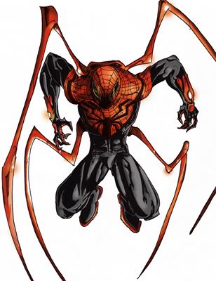
12.) The Ends of The Earth Armor- We are back to bulky again, but at least it is a little more streamlined and gives Spider-Man more of a sense of motion than the silver jobber from years earlier.
(image from marvel.wikia.com)
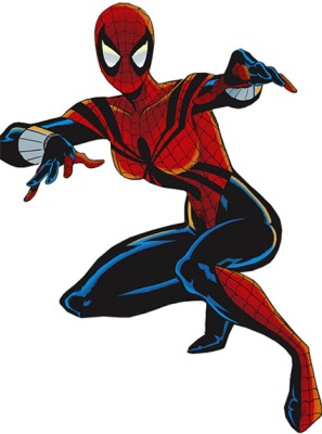
11.) Scarlet Spider II- A little too simple to place higher on the list, but I like it. It fits with Kaine, aka the guilty clone, his personality and his desire for an uncomplicated life.

(image from killermovies.com)
10.) Cosmic- It’s almost too busy to work. Almost. But then, wouldn’t you know it, it pulls it off.

(image from comics-rpg.board.net)
9.) Ben Reilly- I go back and forth on the blue stripes on the arms. It feels a little too much to me, but the external web shooters are a good look.
(image from comicvine.com)
8.) Superior Spider-Man- The black for blue and the use of the “legs” nicely incorporate the guise (Spider-Man) with the man in charge of the body (Otto Octavius aka Doctor Octopus).

(image from marvelheroes.com)
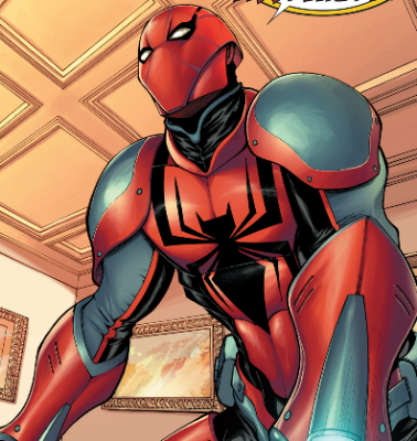
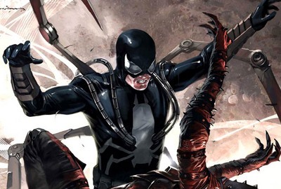
7.) Iron Spider- Actually, in my opinion, a very cool look. It scores a little low just because not every artist seemed to be able to confidently render it.
(image from comicvine.com)
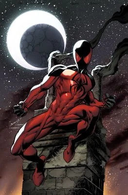
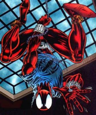
6.) Scarlet Spider I- The colors/ the exposed web shooters. And, yes, the blue hoody. It’s all pretty great.

(image from spiderman.wikia.com)
5.) Stealth Suit (red)-Loses by a nose because the red flattens the suit rather than gives it more depth.
(image from marvel.wikia.com)
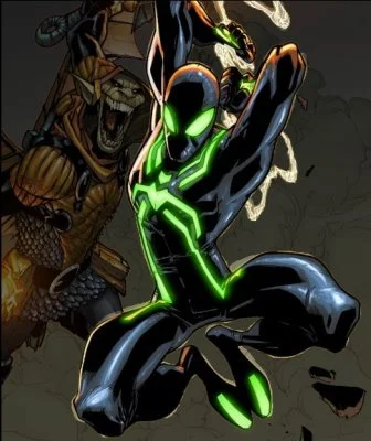
4.) Stealth Suit (green)- Spider-Man meets Tron. The green really makes the costume and the design of the spider pop, making it all very eye catching.

(image from whateveraspidercan.com)
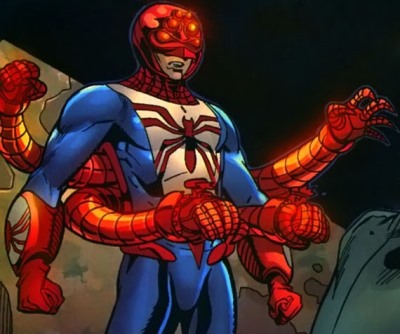
4.) Massacre Armor- Very different in color and general design, even the eyes are different, small, curved slivers on his helmet. Different yet entirely recognizable as Spider-Man nonetheless. And unlike the rest of the armor on the list, the only design that seems sleek enough to fit with Spidey’s dominant abilities.
(image from comicvine.com)
3.) The Future Foundation- Love the design of the symbol and how its legs work through the rest of the costume. I really like ratio of black to white and it can shift to negative as well.

(image from bamsmackpow.com)
2.) The Black Suit- Simple. Clean. If it came first, I’d probably love this one. But it didn’t. So it doesn’t come in first on my list either.
(image from tumblr.redcell6.com)
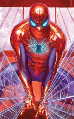
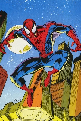
1.) Classic- For my purposes, I lump webbed and non-webbed in this category. Why? Because I do what I want. Remember that.
Anyway, we call it classic for a reason, don’t we? The other costumes on this list, many of them are cool. None of them are perfect. This one is.
Spider-Related Folks
(image from comicvine.com)
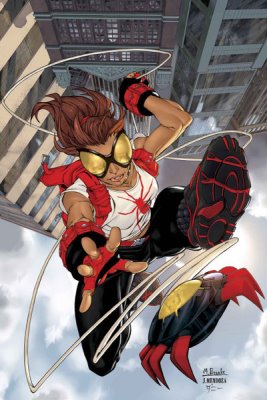
14.) Spider-Man 2211- What a dumb looking costume. I know that’s not exactly trenchant, but…it’s just so dopey looking.
(image from marvel.com)
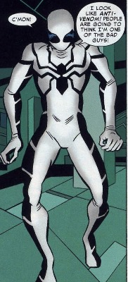
13.) Spider-Woman (Mattie)- It’s...not great, you know? Unrelated to her costume, but I never talk about Mattie so let me say here: she got a raw deal.

(image from comicbookreligion.com)
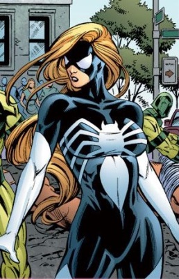
12.) Spider-Woman (Jessica)- There are people that love this costume, I am not one of them. I think there’s just too much yellow for me.
(image from writeups.org)
11.) Spider-Girl (Mayday)- It’s just Ben Reilly’s costume, really. I like it but it doesn’t offer me anything different.
(image from comicvine.com)
10.) Arana- I actually think this one is a lot of fun but it’s just not much of costume, you know? It’s more of a look than a costume.

(image from comicvine.com)
9.) Arachne- I don’t know…I just like Julia better in the more directly black costume inspired suit. This stylized spider and a lot less white does not work as well for me with her.

(image from fansided.com)
8.) 2099 Current- It looks great on covers, it loses something on interiors and in motion. Good, but not great.

(image from comicvine.com)
7.) Spider-Girl (Anya)- Remember how I didn’t love this on Carpenter? I like it better on Corazon. It just works better with her size and lines. And perhaps because I never saw here in the more classic version I saw Carpenter in. I am open that possibility.

(image from marvel.wikia.com)
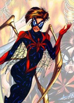
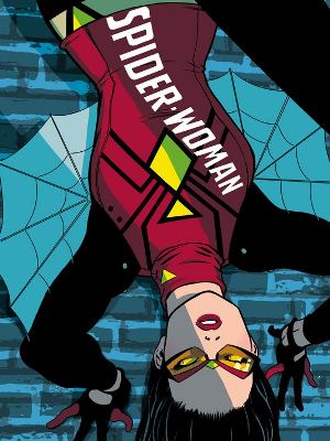
6.) Silk- So different than any other suit on this list and it still works. It “feels” like a Spider character design without sacrificing the unique design.
(image from comicvine.com)
5.) Spider-Woman (Julia)-“My” Spider-Woman, if you will. The black costume is great already and the use of more dominant whites on Julia’s interpretation makes it pop just that much more.

(image from comicsalliance.com)
5.) Spider-Gwen- Like Silk, such a different interpretation yet so recognizable as Spider-related. Love the use of color a bit more here though, especially that blue.
(image from atomicthinktank.com)
4.) Steel Spider- I love Steel Spider. LOVE! No apologies. Love the color scheme, the spider, the way the “legs” look, even the mask. LOVE.
(image from marysue.com)
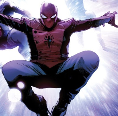
3.) Spider-Woman (Jessica with jacket)- Great reinterpretation of her color scheme with a more modern take. So very much better than the original.

(image from marvel616politics.com)
2.) 2099 Classic- The Spider-Man color scheme but darker. The shredded web underarms. The claws and spines. The Spider-Man symbol interpreted as skull. It’s a wonderful take on the design that nicely recalls all the classic Spidey elements without repeating a note.
(image from marvel.com)
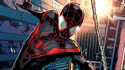
1.) Ultimate Spider-Man (Miles)- Great use of the red highlights on black. Exactly the kind of suit you’d wear to honor your predecessor as you remained ambivalent of your worthiness of said mantel.